

Thursday 3 December 2009


Tuesday 1 December 2009


Monday 30 November 2009
Portfolio Task 2
At the start of the 20th century brought a new kind of art based upon reflecting the modern world. Expression was one of the main themes of this new art; the idea that the art would be more personal to the artist. As the 20th century drew on, the artists of the avant-garde were striving to create a true, yet expressive depiction of the times, focussing heavily on their appretiation of nature in response to urban life and industrialization. 'Modernism' was present across most of Europe; and soon the avant-garde concept was internationally known. France dominated the scene, with the German speaking countries developing a more subjective style based more on the theories of German philosophy and traditional German culture. The relatively late arrival of modernism in Italy showed an art more driven by the working class; bringing to light to strong socialist ideals of social equality, (which the bourgeoisie feared enormously). This arose from Marx's theory that trying to practically change the world was more vital than simply trying to comprehend it.
It is without doubt that Cubism was the reason why France was so central to the development of 'Modernism'. Expressionism and Futurism had responded to urban modernity with clarity, while Cubist art was far less transparent in it's representation. The clue was not so much in the subject matter, but instead it lay with the shifting planes on the surface. The varied perspectives of the chaotic planes offered an a technically advance and innovative vision of the modern world. Ironically, as these means of representing the world would cease to change in a changing world, the Cubist style would fail to represent the modern. Despite the continuing debate as to whether the modern world is depicted through translating it and striving to change it, or whether it is the job of the artist to transform art itself, Cubism remains a significant element in the transition between the modern art of the 19th and 20th century.
Wednesday 11 November 2009


Tuesday 3 November 2009
Porfolio task 1: Image analysis exercise
The Uncle Sam Range (1876) Advertising image by Schumacher and Ettlinger, New York
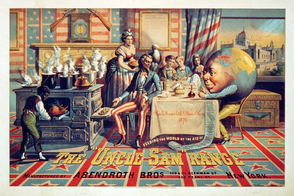
In this advertisement the company have chosen to sell the product through a variety of means other than simply showcasing the actual stove. Firstly, there's the fact that the stove is actually to the far left of the composition rather than dominating it. They appear to have played on the centenary of America's Independence, with a strong, almost tasteless use of red, white and blue, and stars and stripes. There is a continuous theme of patriotism and celebration which can be seen in the view through the window of a Philadelphia building where many celebrations of America's Independence. The company has certainly used the spirit of the time as a way to promote their product. They bright colours and garish patterns dominate the image, however there is a lot of more subtle detail within the illustration, almost every element symbolic in some way. The typeface used for the company name is in a 'wild west' type of font representing America's pride after they overtook the 'savages' originally inhabiting the land. Interestingly, most of the lettering used is actually part of the composition in some way, rather than standing alone which might have had a stronger visual impact, for example; the letters almost appear to be part of the flooring, slanting away at the same angle, in perspective with the rest of the room. The composition itself is very crowded. This and the overpowering use of colour represents the idea of decadence, which I think is how America wanted to be seen at this time.
To me it is clear that this advertisement is actually showcasing the 'American Dream' in all its glory. The gentleman in the picture represents a powerful, dominant male character both in character; his attire and his upright stance. He is presenting the food, although neither he nor his wife are actually cooking. Instead their slave is labouring over the hot stove. This could represent America's attitude to Africa at this point in time, in the same way that the 'world' character has African facial features which protrude from where Africa is on the globe. America's attitudes to other countries of the world appear to be represented in the receipt for the world's requests for food which doesn't actually make any real sense in terms of what each of those countries would actually request.
I think that this advertisement is aimed at the lower middle class. People of classes below this would probably not have been able to afford stoves such as this, and upper classes would possibly have it already. The stove would appeal to 'social climbers' who want to be in the scene depicted by the advertisement, dining on food served by their slave from their Uncle Sam Range state of the art stove, just like the gentleman in the advert.
Poster by Savile Lumley (1915)

The date in which this poster was produced, and of course the content, imply that it was a propaganda poster, trying to encourage men to enlist into the army during World War I, before it later became mandatory. It was most probably aimed more a men of the middle class, rather than those from the working classes, as they would almost certainly have enlisted already. Also, at this time, the number's of people enlisting had dramatically dropped.
Unlike the previous advertisement, the text in this poster is along the bottom of the image, separated from the composition. The black background allows the white text to stand out. The word 'You' is underlined and capitalized making it stand out. These are supposed to be the words of the man character's little girl who's is presumably reading about the war in her book. It is unlikely that the little girl would actually have put an emphasis on the word 'you' when asking the question. This is the effort of the designers to perhaps intimidate the viewer, or at least get their attention. In addition to this, they have chosen to glamorise the 'Great War' by using capital letters, and referring to it as something glorious, despite the fact that they have not even finished fighting it yet, let alone won it.
Like the previous advertisement, there is a lot of symbolism within the at first, visually simple image. For example the patriotic references to England; the Fleur de lis, and the toy soldiers that the little boy is playing with in the foreground, who actually wear the proud red uniforms of the queens guards. This and the way in which both children are reflecting such interest in the war make it seem as though they are further trying to glamorize the idea of being a soldier, implying that it would give you some kind of heroic, even celebrity status.
The symbolism and the patriotism in this poster is far more subltle than in the previous example. I think that this reflects the differences between English and American culture, at least at the time.
The man in the image looks out at the viewer, making eye contact and sharing a kind of 'mutual shame' that they may not have enlisted either, making it more personal. This advertisement plays on human emotion by triggering feelings of guilt, shame and a loss of pride.
Subscribe to:
Posts (Atom)